This bubble chart portrays data about education systems in Tanzania through the representation of circles. This data is based on the average percentage of students that pass their school exams in a specific district (the larger the bubble, the more students pass their school exams within a district). Bubble charts are visually aesthetic and also allow the packing of hundreds of values into smaller spaces.
- Total Students Enrolled:
- Total Number of Teachers
- Average Nation School Rank
- Total Students who Passed
These maps compare the staff needs of schools over the next 35 years. We used population.io data for the next 8 years, and conservative UN projections from 2023 to 2040. Using current teacher to student ratios, we project how many teachers will need to be hired in the coming decades. By 2040, the number of teachers will need to double to maintain the current ratio.
Present
Year: 2023
Year: 2040
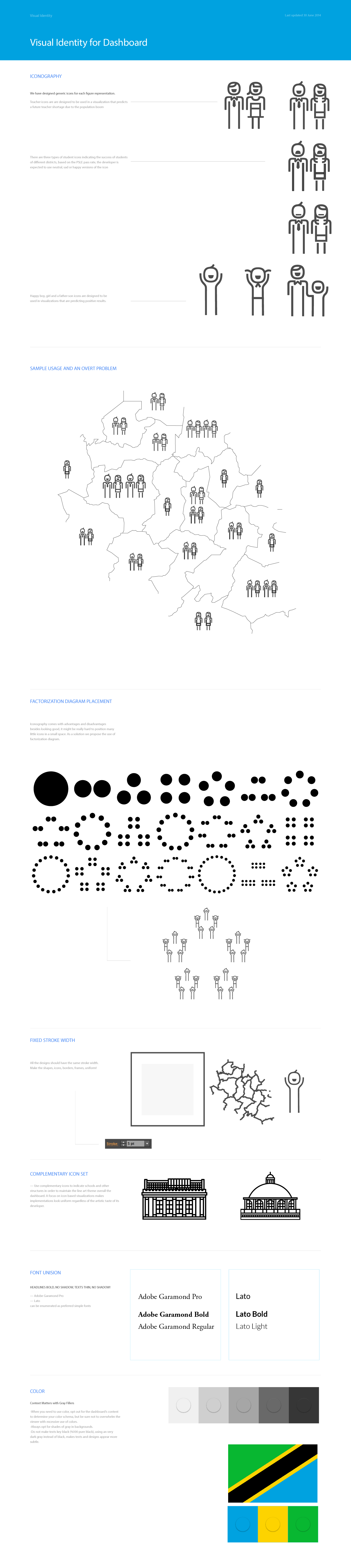
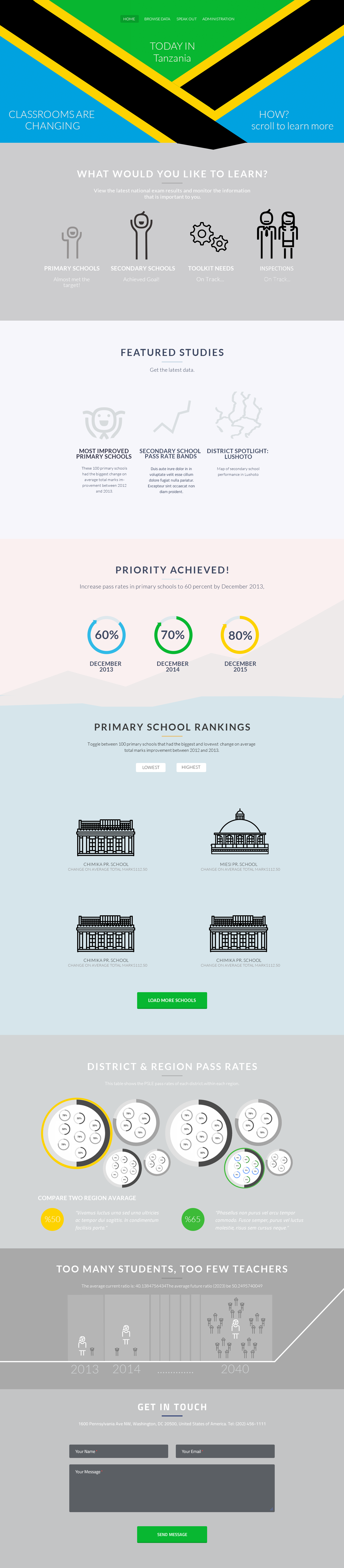
Visual Identity Guidebook and Iconographic Schema
We created these design themes to make existing open data dashboards more relevant and readable by Tanzanians. Check them out: